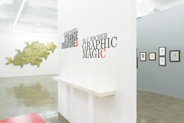
M.C. ESCHER: GRAPHIC MAGIC | RICHARD HASSELL: STRANGE CREATURES
29 October - 3 December, 2016
Opening | Friday | 28 October, 6-9 pm | ARNDT Fine Art at Gillman Barracks (Block 9, #03-21)
This exhibition will feature selected original works by M.C. Escher and Richard Hassell.
M.C. Escher's original prints, printed by his own hand, will include some of his most famous works such as 'Day and Night,' 'Concave and Convex,' 'Print Gallery,' as well as smaller more affordable vignettes and ex libris works. An original M.C.Escher drawing and watercolour will also be on show.
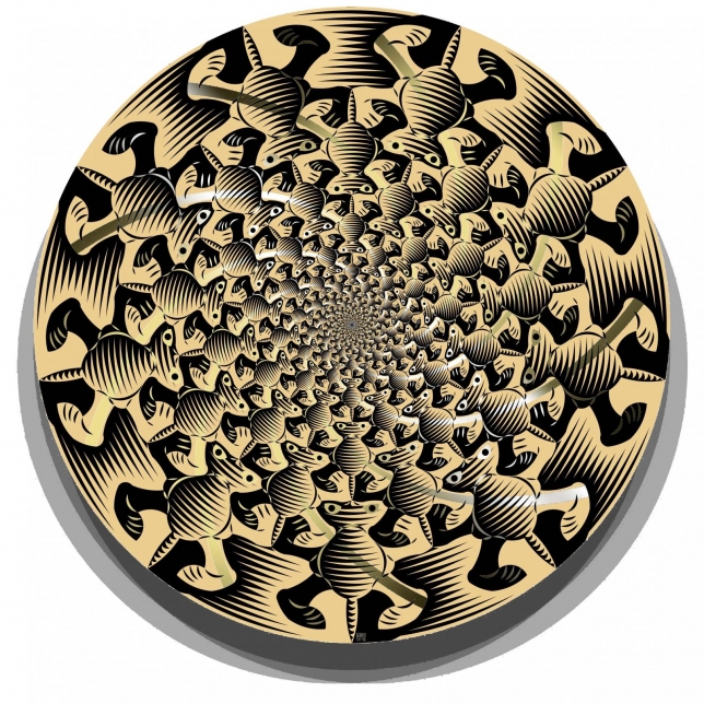
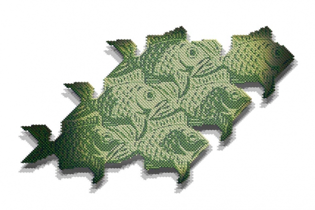
Richard Hassell is showing 24 tessellation works on paper and 6 large works on aluminium. The tessellations are based on complex aperiodic geometries such as fractals, and plane-filling curves. These geometries structure many elements and phenomena of the natural world. The "strange creatures" in the tessellations evolve from the rules of these fascinating geometric worlds. Many of the prints feature hand-applied gilding, a traditional skill in Java, made in collaboration with innovative Indonesian textile artist, Baron Manansang. While the prints draw on Escher's oeuvre, the designs also refer to South East Asian textiles, tribal art and the history of science and mathematics.
Two of Hassell's works are showing in the exhibition "Journey to Infinity: Escher's World of Wonder," in Singapore's ArtScience Museum at the Marina Bay Sands integrated Resort, which is opening on 24 September, 2016 and runs until February 2017.
For more information, please click here.
Press Contact:
Pey Chuan Tan
peychuan@arndtfineart.com
+65 9111 3203
Venue:
ARNDT Fine Art Pte Ltd
Gillman Barracks
9 Lock Road #03-21
Singapore 108937
Tel. +65 67340775
Opening hours: Tues - Sat 11am- 7pm, and by appointment
Press:
The Business Times | Geometric Sorcery | September 23, 2016
STRANGE CREATURES
Interview with Richard Hassell
What am I looking at here?
These are a series of works on paper and aluminium, using tessellations.
What are Tessellations?
I am just going to quote from Wikipedia – “A tessellation of a flat surface is the tiling of a plane using one or more geometric shapes, called tiles, with no overlaps and no gaps. … Tessellations form a class of patterns in nature, for example in the arrays of hexagonal cells found in honeycombs.”
Tessellations were extensively used in Islamic art and architecture, although their ban on representative images means that traditional tessellations are abstract shapes. Here in South East Asia, our most familiar tessellations are the Batik textiles, which use a copper stamp to print cloth with a repeating, tiled pattern. But any tiled floor or bathroom wall is a tessellation. We are surrounded by them!
Why do you call your works “Complex Tessellations”?
Again from Wikipedia – “A periodic tiling has a repeating pattern. Some special kinds include regular tilings with regular polygonal tiles all of the same shape, and semiregular tilings with regular tiles of more than one shape and with every corner identically arranged. The patterns formed by periodic tilings can be categorized into 17 wallpaper groups. A tiling that lacks a repeating pattern is called "non-periodic". An aperiodic tiling uses a small set of tile shapes that cannot form a repeating pattern.
The 17 wallpaper groups have been explored for centuries, almost all tilings are based on them. Non-periodic and Aperiodic tiling systems were really only discovered in the 1970s, so are fairly recent. Because they are quite complex, they have not been used much in applied design and ornamentation, or if they have, have been used quite “out of the box” and have not had extensive research on their decorative potential, other than their shapes.
I am interested in their design potential, because the centuries-old traditional tilings have very few surprises left in them.
Give me an example of complex tilings?
Federation Square in Melbourne is a major public building that is covered with aperiodic tiles, which give the building a very interesting façade. It uses Pinwheel tiling, developed by a mathematician called John Conway. My architectural practice has used complex tilings extensively, for instance in the façade of the Intercontinental Resort in Sanya, China.
Why do you refer to the work of M.C. Escher?
I find the work of Escher very interesting. Apart from his qualities as an excellent graphic artist, making beautiful woodcuts and lithographs, it is the way he fused art and mathematics that interests me. He was actually a poor student in terms of grades, but he obviously had very powerful geometry processing in his brain, so he ended up in a kind of duet with current mathematics research, making images that were a tool for exploring geometry, despite having no ability in calculation. He spoke at crystallography conferences and was in correspondence with some of the
greatest thinkers in physics and mathematics in the 20th century, despite being unable to understand any of the papers. I am exactly the same, my brother is a pure mathematician, and he used to drive me mad, chuckling at a page full of theorems, saying “oh this is very wittily proven”. He could also read musical scores and hear the music in his head, which was also very annoying, when I couldn’t do it! However I can enjoy and play with geometry in quite a sophisticated way, despite being able to barely calculate an angle using algebra.
What is the difference between your work and that of M.C. Escher?
Escher died in 1972, after having exhaustively researched the decorative potential of the 17 traditional “Wallpaper Tiling” groups. But the 1970s were a bumper decade for new discoveries in geometry, and many of the ones I have been exploring were discovered just after Escher died, for instance the Penrose Tiling was published in 1977, and Fractals were named in 1975 by Benoit Mandelbrot. This was also the decade of chaos theory with the Butterfly Effect (1972) and complexity theories (Santa Fe Institute, 1984), and this mathematics was part of that understanding of weather, waves, mountains and clouds, it is the mathematics of nature. These dynamic, iterative, chaotic systems could really only be understood through computer modelling, so this mathematics is something that could only be worked through in the digital age.
Why and when did you start doing these?
I have always had a parallel art practice to my architecture practice – in fact I first started a fine art degree before changing to architecture. I had been doing more traditional paintings oil on canvas works in a studio, when I lost my workspace due to the building being redeveloped, and couldn’t find anywhere else close to home. So I had to do very clean work in my apartment, as I am a very messy painter!
I started thinking about working on digital art, since I had very little space. I have always been a science nerd, coming from a family of scientists (my dad is a paleo-botanist, my mother microbiologist, my sister a physicist and I already mentioned by brother is a pure mathematician) and I had loved doing tessellations as a child. My new works started with the thought “What would Escher have done with a Penrose Tile?” and I experimented with it. It was really interesting how Penrose tiles fit together and what complex arrangements they make, so it took some time to work out a solution. When I had one, I sent a copy of the print to Sir Roger Penrose, and he replied back that it was the best he had seen. That encouraged me, so I kept going with them. I kept developing this design, it is the one in Frog Star III which is in the exhibition.
Why do you use these animals, the Strange Creatures? Isn’t geometry about abstract patterns?
We humans love to look at animals. Just look at kid’s pajamas! I think there is a whole host of reasons why animals are something we respond to very viscerally. First, we are animals ourselves, so we find it easy to “map” ourselves onto an animal, especially ones with similar body structures – arms, legs, heads, bodies – so we instinctively react to the orientation of the animal – climbing, hanging – and the movement. Secondly, we are hunter gatherers, so our visual processing is designed to seek out animals against the background – to survive we need to see the deer in the undergrowth, and to watch out for the tiger in the jungle, so I think our brains have a constant “animal watch” module that is running in the background. Animals have evolved to try and blend with the background using camouflage, our brains have got very good processing to pick out animal shapes even when highly disguised.
The animal motifs change our level of engagement with the image, and activate our brain more. Whereas a pattern might be pretty or meditative, it takes a lot of work to understand how the elements go together. But with the animals, you can instantly see that this tile is slightly rotated versus that tile, or that the green frog appears every so often.
The tiling rules in these complex tiling systems are very restrictive, so there is also a degree of difficulty in making recognizable creatures, and there is also a joy in discovery in finding them. And often they are quite strange due to these restrictive rules, so rather than thinking “this lizard is looking a bit peculiar” I think of the tiling system as a kind of alien planet, where there are slightly different evolutionary pressures or laws of nature, and these creatures have evolved to be perfectly adapted to their strange worlds. So I experience a “David Attenborough” delight in finding and sharing them with others.
If just abstract, the designs would be attractive and complex. But by activating both our animal instinct brain as well as our more abstract-pattern-interpreting brain, I find there is an interesting sensation, similar to the figure-ground reversal that appears in the Escher tessellations, where you can only see black or white, but never both motifs at the same time.
For me I get figure-ground, abstract-realist, and repetition-difference reversals all going at once, which I find both stimulating and meditative. It seems to work on other people too!
But is this Art? It sounds maybe more like design or science?
They are definitely at some intersection of design, science and art. But I think that is quite an interesting place to be. Art is a way of making sense of the world, of interpreting what we see or feel, and producing things that reflect and communicate that understanding. These pieces are a way of learning about some strange aspects of the universe which are not well known to laymen, and are typically shared in very arcane and difficult language of the mathematician or physicist that make them inaccessible to most. Here you can just see it in a single instant and appreciate it with your eyes and say “cool”!
Lastly, how do you make these, can anyone do it?
I make them using a combination of research, drawing, software and both digital and hand production. I troll mathematics publications and sites to find interesting tilings. When I see something with potential, I work with it in my architectural software, and experiment with its particular qualities. I have a kind of a “hack” where I trick the software into generating me fields of the tiles semi-automatically, using the “block” command in Autocad, where I do blocks of blocks of blocks (and so on), so I can rapidly generate the complex arrangements of tiles, which are all linked back to a single definition of the tile I can start modifying.
Once I work out its inherent rules by playing with it using simple markings on the tiles, I test how the edges match up and what are the constraints and opportunities in the edge matching rules. I then set up the field of tiles, and start playing with shapes and the design. This is where the “Strange Creatures” emerge. My years of reading nature books, observations in the wild, and watching wildlife documentaries combined with a childhood of drawing animals, and then later, life drawing, helps me see the creatures in the shapes and to develop their anatomy. I have a wide visual vocabulary of tribal and traditional art and textiles from my long study of these fields, so I am also looking for resonances with these rich visual resources.
Once there is something interesting, I print it out and work over it by hand, and then in the computer, then back by hand, to shape the creature and get it feeling alive and with a personality. I then work on colours and shading within the software.
Lastly, I work on the final design in Photoshop to get it ready for printing.
The works in the show use two kinds of printing. One is an archival, pigment ink print on sustainable Awagami paper, which is a lovely paper made by a Japanese paper company in traditional ways, but for the digital printing process. Some of the prints have then got hand-applied gilding which has been done in Java with my friend and collaborator Baron Manansang, who is a wonderful textile artist and innovator.
The other pieces are printed on aluminium composite panel, using a process called Dibond. This creates a very hard, long lasting image that is fused into the surface of the aluminium. Where it is interesting is that the brushed metallic surface shines through the printing, so it is a very lively, reflective surface, which I then use to highlight aspects of the design. The aluminium is much larger and stronger than paper, and I have produced large pieces by tiling with the composite panels, which of course is how we clad buildings too.
A typical piece might involve many hundreds of hours of work, and some of them have taken over 12 years to develop, not continuously of course, but as something that gets played with, then gets stuck in some way, and suddenly I have a breakthrough and can finish the piece.


